Dulux Colour Futures 15
As part of Dulux’s ongoing celebrations of colour for the 2016 Colour of the Year – Cherished Gold, we were chosen to reimagine the core palette through our dynamic use of pattern. Dulux offered exclusive access to the colour of the year prior to launch for us to interpret into two unique installations and exhibitions celebrating the innovative use of colour.
At the Colour Futures event at Somerset House in mid-September, our installation consisted of three simple elements that represented our core ethos of surreal and forward-thinking graphics to create a unique synthesis and visual language. The Dulux core palette was translated into a flooring concept forming a prelude to a much larger installation at Tent, London’s premier design event.
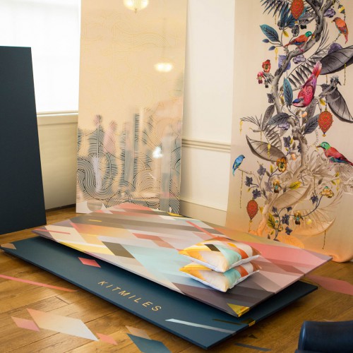
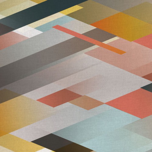
“The challenge,” says designer Kit Miles, “was to find a way to use soft and very gentle colours to convey the same sense of power and force my studio is known for. It turned out that by carefully combining the colours as elements and sharp ‘galactic’ forms, strength can be represented. The colours really glowed and feel very aspirational.”
Following on from our award for ‘Best Use of Colour’ at the Dulux Let’s Colour Awards in March this year, we found our initial inspiration from the notion of looking both ways. Our aim was to find newness in defining visually a dialogue between the present and the past. We immediately started thinking big and set our eyes on the floor.
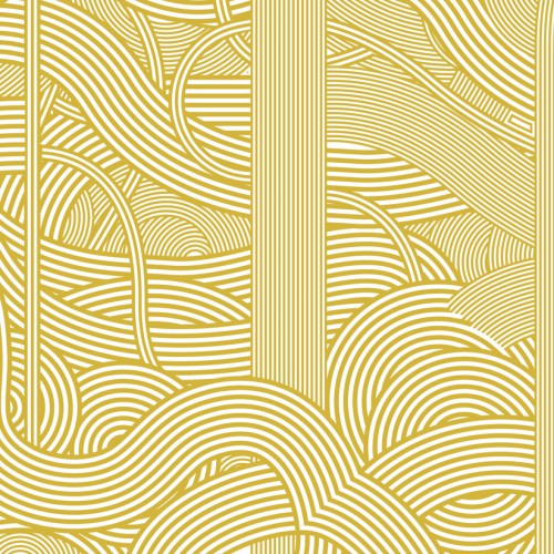
We re-imagined our Diagonal Gradient pattern in Dulux’s Cherished Gold Colour of the Year and chose the complementing shades of tan, dark chocolate, duck egg, and blush, taken from the wider palette.
Rebecca Williamson, Dulux Senior Colour, Design and Content Manager says: “It’s been an exciting process working with Kit Miles and offering him a preview of the Colour of the Year ‘Cherished Gold’ and its complementing palette – we’re delighted with the results. Kit’s signature Diagonal Gradient pattern design works perfectly with these shades.”
Working within the Colour of the Year palette presented interesting design opportunities, traversed through a blend of patterns and shapes interpreted through a forward-looking floor tile concept. The collaboration with Dulux was a chance to ask the viewer to relook at colour and ask questions about how we apply colour to our environments.